In today’s fast-paced financial environment, stakeholders face an overwhelming torrent of numbers and metrics. From stock prices to macroeconomic indicators, the sheer volume of information can obscure the insights that drive profitable decisions. By turning raw figures into visual forms, analysts and executives gain clarity. In this article, we explore how visualization serves as the bridge between data complexity and strategic action.
Financial markets generate an immense array of variables—prices, volumes, indices, and ratios—that shift by the millisecond. Without a visual framework, important details hide in spreadsheets and databases. Visualization allows us to translate numerical data into visual stories, revealing trends that remain invisible when viewed as tables alone.
Through charts and interactive dashboards, teams can respond faster, spot anomalies, and collaborate more effectively. The goal is to transform an avalanche of facts into actionable insights through visual narratives, enabling everyone from traders to board members to align on priorities.
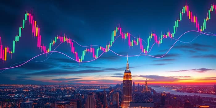
Different chart formats highlight distinct aspects of financial data. Selecting the right type unlocks the story behind the numbers and clarifies complex relationships.
These visual formats often appear in platforms like Bloomberg Terminal, TradingView, and Tableau, each offering interactive controls to dig deeper into the data.
Creating powerful visuals requires more than plotting points on a chart. Designers and analysts should observe fundamental guidelines to ensure clarity and interpretability.
As data volumes grow, financial firms leverage AI-driven tools to enhance visualization. Predictive models can overlay expected price paths on historical charts, while anomaly-detection algorithms flag unusual trading patterns.
Network graphs and parallel coordinates are gaining traction for multivariate analysis, revealing relationships among stocks, funds, and macro indicators. These methods uncover hidden drivers of market moves that simple charts might miss.
Leading institutions illustrate the impact of well-crafted visuals. At JP Morgan, proprietary dashboards integrate real-time feeds from equities, fixed income, and commodities, empowering traders to react within seconds. Meanwhile, BlackRock’s risk teams use heatmaps and network graphs to monitor portfolio concentration and counterparty exposure across thousands of asset classes.
Retail platforms like TradingView offer annotated candlestick charts, enabling individual investors to overlay news events and earnings reports. Public tools such as FRED and Google Finance provide interactive time series with event markers, making macroeconomic analysis accessible to students and analysts alike.
Looking ahead, the fusion of AI and visualization promises a new era of market intelligence. Automated narrative generation will craft tailored insights, guiding users through complex datasets with minimal manual effort. As institutions and retail investors alike demand faster, deeper understanding, the ability to present actionable insights visually will become a defining competitive edge.
By embracing best practices and cutting-edge techniques, financial professionals can transform oceans of data into clear, compelling stories. Visualization not only illuminates the past but also shapes our ability to anticipate what comes next in the ever-evolving world of markets.
References